5 minute read
Come to think of it, business cards aren’t really “cards” as they are portable advertisements with built-in CTAs (Calls to Action). Did you know that 80% of business cards don’t make it to their use and end up in the trash can? Why? Poor design!
Improving the design of your business card implies improving your business. As we move into the new year, we’re seeing brands experiment with new explosive designs, incorporating elements like free fonts, that reinvent what those little rectangles could and can do.
So without any more ado, here are 8 amazing and top trends in business card design that are sure to set you up and showcase your brand as a modern one, with cutting-edge professionals.
Oval business cards
When you think of ‘business cards’, what shape comes to mind? Most business cards are rectangular. But there’s no Business Card handbook that says you have to go in that direction. Therefore if you desire to set yourself apart, why not choose a different shape? For example oval business cards.
When designing a square, circle, oval business cards, or whatever shapes come to mind, the sky’s the limit. Take it is a unique opportunity to stand out from the crowd and secure the title of “most unique business card.”
Such a design strategy is ideal if you desire to show you’re comfortable reasoning outside the box and putting your own spin on business traditions.
Minimalism design
The world now seems to be turning everything into smaller pieces, compact in nature. This proves that minimalism is slowly taking its course and gaining momentum. It however doesn’t reveal itself anywhere else better than it does in graphic design.
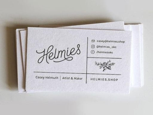
Are you running a demanding and serious business in the legal or real estate industry as an example? You definitely have to deploy your business cards in the minimalist design. This is without adding or extracting your important details. Current business card design trends will majorly favor this style and option.
However, you can similarly pursue tested and tried options like dark blue design schemes or black and white. This still gives room to narrow down on text and also make use of catchy or straightforward phrases which impressively get to your client and build a satisfactory and amazing first impression.
Make use too, of the right font if you desire to go the minimalist way. For a more classy finish, elegant or a bit old fashioned, take into consideration Helvetica or Baskerville. In different scenarios, you can select other universal options such as Futura, Arial, and other well known versions of the sans serif font.
Softie styles glow up
Is a casual conversation suitable for your brand? Are you looking for a friendly design? Well the modern spin on the softie styles that dates back to the 70s could be your favorite pick!
This style, popularly known now as ‘bubble lettering’ makes use of marshmallow-like, letter forms which have rounded edges. The trend is a little less soft, in 2022, still featuring recognisable and thick typefaces. However, now it features lesser curves and sharper edges
When paired with saturated and bright colors, it gives a familiar yet modern touch. If your company leans to a more retro vibe, playful and bright side, consider giving this option a shot.
Modern-day modernism
On business cards, this mid 1900s modernist design style is making quite a comeback. If you take some time and give it a thought, design elements from this style are a perfect fit for brand cards. They are attention-grabbing and excellent for reading, are memorable and are easily compacted. Despite coming all the way from the 1900s, consider this comeback one of the latest business card design trends.
According to this design, “form follows function.” Visuals prioritize the rational purpose of a subject (and in this particular case, business cards) over the creative expression.
Elements of modernism that we’re seeing on business card trends this year involve primary colors, basic shapes like circles and triangles, and strict grids like in nechu’s example below. Last but not least, the style is famous for its bold, sans serif fonts, which translate perfectly to pocket-sized cards.
Anti-cards
An anti-card is a card that is not. They are made halfway to stand out and halfway for irony. Consider this another opportunity to showcase your brand’s creativity. Ant-cards incorporate some kind of visual pun which is related to a respective industry or brand,
Bear in mind, for each and every purchase made, you will be rewarded with 4OVER4 rewards coins in your My Influence dashboard. Consider this a one-of-a-kind Rewards Program which gives you an opportunity to earn 4OVER4 rewards coins without having to spend a dime! You can later redeem the coins for 200 free business cards, products or services, or even cool gift cards from other websites. Have you already jumped into the bandwagon?


