2 minute read
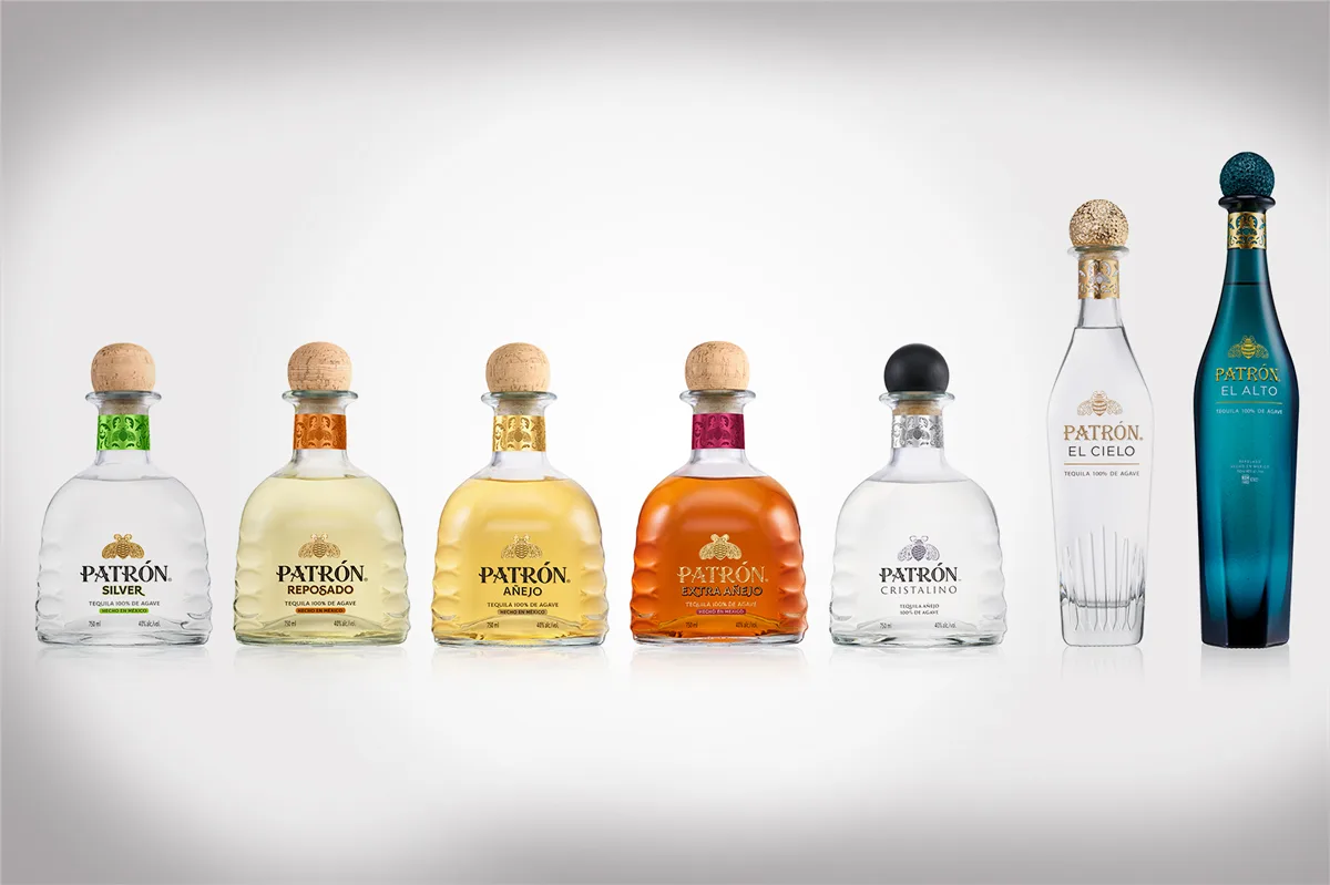
Patrón Tequila has long been known for its instantly recognizable bottle, a silhouette that has stood on bar shelves unchanged for more than three decades. Now, for the first time in 36 years, the brand has reimagined its iconic packaging, and the result is more than a cosmetic touch-up—it’s a statement about where Patrón sees itself in the evolving tequila landscape.
A Bottle That Tells a Story
At first glance, the shape remains the same, but the upgrades are deliberate and layered with meaning. The glass now carries a textured emboss inspired by the heart of the agave piña, a subtle reminder of the ingredient at the center of every bottle. Around the neck, a filigree design nods to the craftsmanship at Hacienda Patrón in Jalisco. And perhaps most striking, the brand’s signature bee emblem now appears as a three-dimensional gold accent, transforming a logo into a tactile symbol of identity.
Transparency, Front and Center
One of the most notable changes is what’s written directly on the label. Patrón has chosen to highlight the simplicity of its process, listing just three words: Agave, Water and Time. The Master Distiller’s signature accompanies it, putting authenticity literally on the front of the bottle. It’s a clear move to reinforce what the brand has been saying for years—that true tequila doesn’t need additives or shortcuts, only patience and craftsmanship.
A Lighter Footprint Without Compromise
Beyond design flourishes, the update also acknowledges sustainability. The bottle’s weight has been reduced by eight percent, a change that cuts down on the carbon footprint without diminishing the premium feel in hand. It’s a quiet but important step, showing that luxury and responsibility don’t have to be at odds.
More Than Packaging
This redesign is about more than aesthetics. Patrón has taken a symbol that was already iconic and infused it with deeper meaning, reinforcing its commitment to tradition, craft, and transparency. For longtime fans, the bottle will feel familiar, but look closer and it becomes something more—a physical manifesto of what the brand stands for today.
